
Leaders and entrepreneurs alike dream of launching an online store unlike anything before it. However, the reality is that you can fast-track your progress and pick up what works and what doesn’t by studying the most successful ecommerce sites.
In today’s digital-first marketplace, your website is often the first point of contact between your brand and potential customers. A well-designed ecommerce site seamlessly guides visitors from discovery to purchase, all while reflecting the unique personality of your brand. Whether you’re a growing startup or an established retailer, investing in strong website design can be the difference between a visitor who bounces in seconds and a customer who becomes a loyal fan.
In this article, we’ll explore 10 outstanding websites that are setting the standard for online shopping experiences. Next, we’ll sum up what was learned by looking at the hallmarks of exceptional ecommerce design. Each example demonstrates how design choices—big and small—can translate into trust, engagement, and conversions.
10 Inspiring Ecommerce Website Designs
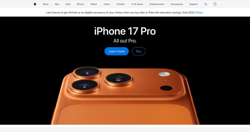
1. Apple
First impression: Sleek, minimalist, instantly premium.
Apple’s core philosophy of “less is more” is exemplified on its websites. This approach ensures their products always have the spotlight without design elements getting in the way.
Its product pages use storytelling and high-quality photography with a touch of intrigue. Features are translated into compelling possibilities for Apple’s loyal fans.
Standout features:
- Ultra-clean product pages with high-resolution visuals.
- Smooth transitions and animations that mimic physical interaction.
- Navigation that emphasizes clarity and product discovery.
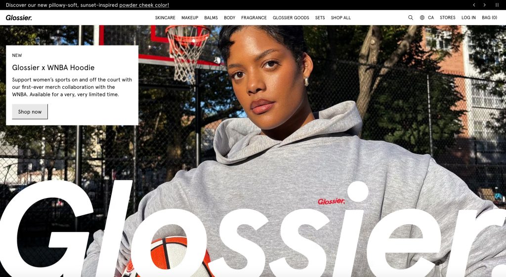
2. Glossier
First impression: Fresh, modern, and friendly.
Glossier’s mantra is “skin first, makeup second,” and the emphasis on highlighting natural beauty rather than covering it up comes through in their design. The website has a clean look, with a back-to-basics colour palette of black, white, and pastels.
In design, if every element is big, nothing is big. One aspect of this visual approach that shines is the stark contrast in the size of the smallest elements, such as body copy, and the biggest elements, such as the hero image of a young woman’s face on the homepage. It maximizes the impact of the largest elements perfectly.
Standout features:
- Pastel colour palette reflecting the brand’s approachable personality.
- Community-driven social proof via reviews and customer photos.
- Simplified checkout for fast, frictionless purchasing.
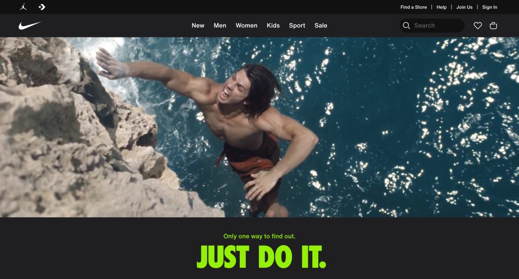
3. Nike
First impression: Bold and energetic.
The elegance and grace of movement in sport is best demonstrated with video, and Nike uses it to great effect on their homepage. Slow motion emphasizes the fluid movements of athletes in a variety of sports, such as skateboarding, basketball, and tennis.
Nike sticks to a basic black and white colour scheme, which allows their sneakers and apparel to stand out. Occasionally, neon colours are added for key text, such as their iconic tagline “Just do it,” which is a recipe for optimum impact.
Standout features:
- Immersive visuals and interactive product customization tools.
- Clear navigation despite vast product categories.
- Mobile-first design with excellent load speed.
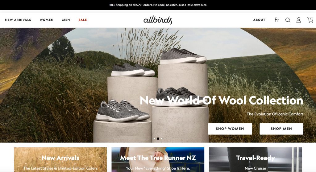
4. Allbirds
First impression: Clean, eco-conscious, approachable.
Allbirds’ site mirrors the brand’s eco-friendly values with a clean, minimal design that feels approachable and natural.
Product pages blend sustainability storytelling with crisp photography, creating a bond with their audience while showcasing quality. The airy layout, transparent pricing, and intuitive navigation streamline the shopping experience. Strong calls-to-action and a consistent, nature-inspired colour palette reinforce the brand identity.
Standout features:
- Storytelling is woven into product pages about sustainability.
- Simple, airy layout reflecting their natural ethos.
- Clear CTAs and transparent pricing.
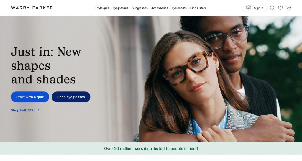
5. Warby Parker
First impression: Stylish, modern, and customer-centric.
Warby Parker’s site is a masterclass in combining understated style with customer-first functionality. The virtual eyeglasses try-on tool has wow factor, and it bridges the gap between online shopping and real-world experiences.
The feel of the design nicely balances sophistication and approachability. Clear navigation and a conversational tone make visitors feel welcomed, while polished visuals highlight both products and lifestyle. Reviews and customer stories add credibility, and they feel like an essential part of the layout rather than an add-on.
Standout features:
- Virtual try-on feature for glasses.
- Friendly, conversational tone in microcopy.
- Emphasis on customer stories and reviews.
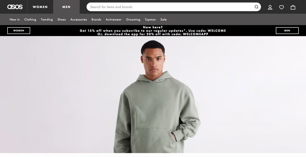
6. ASOS
First impression: Trendy, dynamic, highly visual.
ASOS offers a vibrant shopping experience designed for a fast-moving fashion audience. The site conveys cutting-edge style through bold visuals, rich product photography, and a high-energy layout with plenty of contrast. ASOS is known for leveraging user-generated content, which brings authenticity on social media, and that influence is felt on their website, as the models have a presence that’s full of personality.
Recommendations and filtering tools make navigation effortless despite the large catalogue. Drop-down menus keep the experience visual by displaying round mini photos beside navigational text as well as larger images for highlighted brands, site sections, and promotions.
Standout features:
- Personalized product recommendations.
- Clear categorization for easy browsing.
- User-generated content is integrated into product displays.
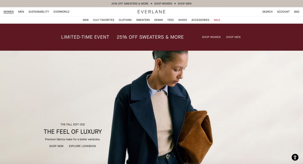
7. Everlane
First impression: Minimalist, transparent, and ethical.
Everlane’s site design proves that minimalism and transparency can be captivating. Crisp imagery on neutral backgrounds keeps the focus on product quality, while concise descriptions and transparent pricing build trust.
Their storytelling emphasizes ethical sourcing and sustainability. Essentially, Everlane’s values focus on enhancing worker livelihoods and keeping the earth clean and cool. The site’s straightforward structure and easy navigation make browsing frictionless, and the streamlined checkout reflects their ethos of simplicity. Everlane’s design works because it communicates values as clearly as it presents products, making customers feel aligned with a purpose-driven brand.
Standout features:
- Radical transparency in pricing and sourcing.
- Crisp product photography with neutral backgrounds.
- Streamlined shopping cart and checkout experience.
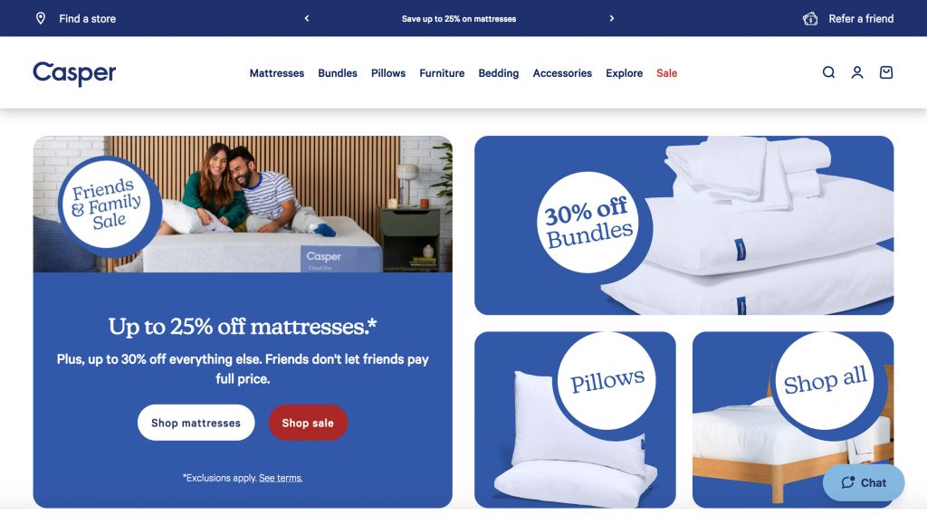
8. Casper
First impression: Comfort and simplicity.
Who says shopping for a mattress can’t be a fun, engaging experience? Casper uses playful illustrations and lighthearted copywriting to give the site personality while maintaining professionalism.
The design is bright, approachable, and supported by strong product photography and explainer videos that help shoppers visualize comfort. Reviews and awards are prominently displayed, boosting credibility. Clean navigation and an emphasis on customer support reflect a customer-first approach. Casper proves that even niche products can shine online with smart design and an inviting brand voice.
Standout features:
- Playful illustrations and animations, plus eye-catching icons.
- Easy navigation despite a niche product line.
- Strong social proof and reviews highlighted on product pages.
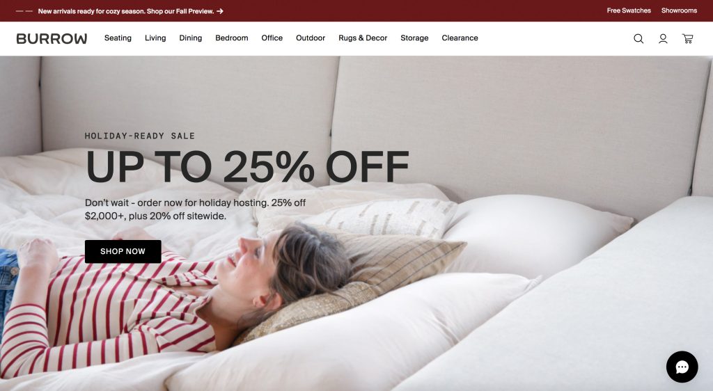
9. Burrow
First impression: Modern, practical, lifestyle-oriented.
Burrow’s site balances style and practicality, much like its modular furniture. Interactive customization tools let shoppers visualize different product configurations, enhancing engagement and confidence in purchasing. Video demonstrations with lifestyle moments showcase products in real-world settings and dramatize the assembly process from unpacking boxes to petting your dog on your new sofa.
The design makes excellent use of whitespace, ensuring clarity despite the complexity of options. Navigation is intuitive, and trust signals like warranties and customer reviews are front and centre. Burrow’s ecommerce platform successfully combines inspiration with utility, creating a smooth, modern shopping experience.
Standout features:
- Customization tools for furniture configurations.
- Video content to show products in real-world use.
- Smart use of whitespace for easy readability.
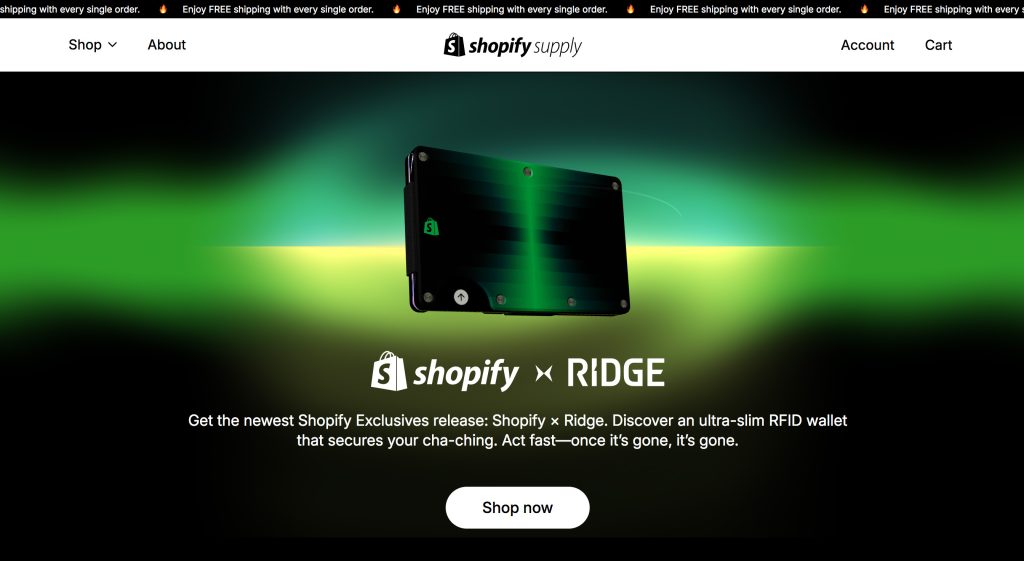
10. Shopify Supply (Demo Store)
First impression: Clean and versatile.
Shopify Supply’s demo store is about much more than selling branded glow-in-the-dark duckies. It showcases the platform’s capabilities with a clean, versatile design that adapts easily to different industries. Its strength lies in clarity: strong hierarchy, straightforward navigation, and well-organized product pages highlight how products can be presented effectively.
The design demonstrates how merchants can integrate compelling visuals, simple CTAs, and optimized layouts for both desktop and mobile. By keeping things minimal yet functional, Shopify Supply provides an excellent model for brands seeking inspiration for professional, conversion-friendly ecommerce websites.
Standout features:
- Showcases what’s possible for merchants.
- Focus on clarity and adaptability for multiple industries.
- Strong hierarchy in product layouts for easy scanning.

Key Features of Winning Website Designs
User-Friendly Navigation and Accessibility
A great site makes it effortless for customers to find what they need. Clear menus, intuitive categorization, and search functions are essential. Accessibility features—such as readable fonts, alt text for images, and high-contrast colour schemes—ensure inclusivity.
Mobile Responsiveness and Site Speed
More than half of all online shopping happens on mobile devices. If your site isn’t optimized for different screen sizes, you’re losing customers. Lightning-fast load times are just as critical. Shoppers expect pages to load practically instantaneously.
Visual Appeal and Brand Personality
As the saying goes, there’s no second chance to make a first impression. Particularly online, first impressions are everything. Bold imagery, consistent colour palettes, and thoughtful typography tell your story before a single product is clicked. The design should reflect the mood and values of your brand, whether that’s minimalist, playful, luxurious, or eco-conscious.
Compelling Product Pages and Calls to Action
Strong product photography, detailed descriptions, and prominent “Add to Cart” buttons can make or break a sale. Pair this with persuasive microcopy and clear CTAs to keep shoppers moving through their journey.
Trust Signals, Customer Reviews, and Social Proof
Nothing fuels conversions more than trust. Badges, testimonials, reviews, and recognizable trust marks reassure customers that your site is safe and your products are reliable. These elements build credibility and reduce friction in the decision-making process.

Why Drawing Inspiration Matters
When you’re planning your own ecommerce site, looking at examples is one of the best places to start before sparking ideas.
Along your journey, you might notice how one brand uses bold typography to express energy, while another uses soft colours to communicate trust. Some of the best solutions are simply a blend of different approaches you admire. You might be inspired by interactive tools, product storytelling, or simply the way a checkout process feels effortless.
Drawing inspiration allows you to clarify what resonates with you as a leader or business owner. Most importantly, it shines a light on what’s resonating with customers like yours around the globe.
Conclusion
Think of your ecommerce website as a living representation of your brand. The best designs blend functionality, speed, and trust with unique storytelling that makes customers want to stay, explore, and fill their cart. By studying some of the top online stores in the world, you can gather ideas and insights to craft a shopping experience that truly stands out.
Need help with translating your vision into a powerful, conversion-driven website? Contact our team at Nuflux Media to craft an ecommerce site that inspires trust, loyalty, and sales.