Few have ventured into the ghettos of the advertising world and bothered to tell the tale.
It’s far more glamorous to discuss high-profile flops like Apple’s “Genius” ads, Burger King’s “Herb the Nerd,” or the 1985 “New Coke” campaign.
As in business and as in the playground, the little guy gets picked on often (when he isn’t ignored). I hate to add to it by taking jabs at the advertising efforts of small businesses, but tough love is necessary.
Shoddy creative cripples countless print ads in local magazines. While everyone involved in the process shares some responsibility, it’s predominantly a condition of circumstance.
The uninitiated assume the craft of advertising is easy. Yet every time I open a small publication I see ads brimming with platitudes, clichés and puffery. Being so close to it, the business owner has trouble separating what matters to people from what doesn’t. Strategy rarely comes through so there’s no telling what they’re trying to achieve beyond “more business.”
A local magazine’s in-house production staff takes orders from business owners who dabble in copywriting and art direction with little filtering in-between. Rather than wrestling with them about rudimentary mistakes that make their ads ineffective, complacent designers slap together whatever is likely to get approved.
The magazine doesn’t have the resources to produce effective creative, as this involves the time consuming process of working closely with the client to produce strategies and executions. Additionally many small business owners either don’t see the value in hiring an outside firm, believing they can do the work themselves, or perceive it as a luxury outside of their reach.
What they tend to get is vanity advertising. Its impact is minimal, and it doesn’t connect with the audience it needs to. Instead, it succeeds in temporarily making the business owner feel significant.
Tragically, when the ads don’t produce results the advertiser errs on the side of concluding it was a bad media buy, or that print advertising has lost its effectiveness in general. It’s tougher to admit their weak creative may have sunk the canoe.
Being too small is no longer a valid excuse. Rising talent, suitable for any budget imaginable is out there for those who are willing to look.
Businesses that can’t bring themselves to collaborate with an agency or freelancers shouldn’t be advertising at all. The probability of failure is too high when the advertiser attempts to stumble upon the right mix of media planning, creative strategy and executions without guidance.
Now that I’ve released that semi-rant, let’s take a look at those ten unsuspecting targets, ahem, examples promised in the headline. Although I’ve kept the focus on what I assume are ads with DIY creative, some veer into poor agency work when it demonstrates my point more clearly.
Blunder 1: Ad reflects owner’s perspective, not the customer’s
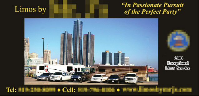
Mr. Limo is proud of his fleet of vehicles. His clientele on the other hand is interested in prestige, a memorable night out and sex. It’s their narrative that must be told here, not his.
A lifestyle ad with beautiful people celebrating inside his best limo would lead to more calls.
Blunder 2: The guy that does everything
Show me an ad with bullet points and I’ll show you an advertiser that needs to focus their message. It doesn’t matter how many services are offered: choose one per ad.
What this doctor is really offering is a boost in self-esteem. He’s made the ad about himself when it should be about how the results restore his patient’s confidence.
Blunder 3: Phony headline that invites skepticism
BK’s “Have it your way” slogan had substance. This headline doesn’t. Is one really doing things their way when they’re required to shift their power usage to get the discount?
The true benefit is saving money (at the expense of convenience), thus it should be in the headline. The empty ad jargon takes away from the core message.
Blunder 4: Lazy art direction
Are you reminded of “romance” when a couple isn’t present in the photo? Do you think “adventure” when absolutely nothing is happening? The two wine glasses send far too subtle a message if any to the casual observer.
Readers would be far more likely to project themselves into the scene if a couple was having a moment of marital bliss. It’s not the scenery that persuades us. It’s the promise of a memorable experience.
Blunder 5: Vague headline
This well-groomed gentleman can help us, but what with? Most readers don’t make it past the headline. So the impression they’re left with is “I can help” and a photo of an individual they have no reason to trust.
Here’s a hint: the headline needs to have the word retirement in it.
Blunder 6: Misunderstanding motivations
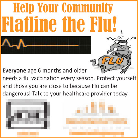
Do parent immunize their children to “help the community?” It’s a noble thought but entirely unrealistic for those outside the healthcare profession. Parents are concerned about their children’s welfare and their immediate family’s.
The use of the word “flatline” subconsciously associates vaccinations with death. It’s not about killing the flu. It’s about gaining peace of mind, and feeling like you’re making the right choices as a parent.
Blunder 7: Failed attempt at being funny
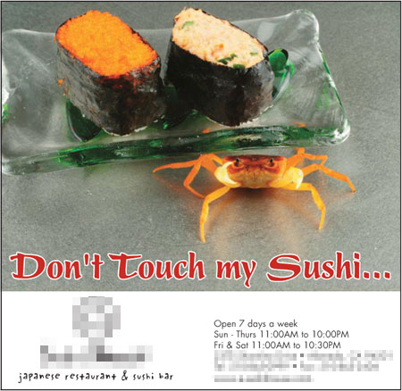
One wonders how this ditty came into being. Was there a “you had to be there” spectacle involving the crab, or is it an inside joke among management?
If taken in at a glance it says, “don’t eat our food.” Besides, the live crab imagery is sure to scare off squeamish westerners who haven’t moved beyond California rolls.
Blunder 8: Buddy ad
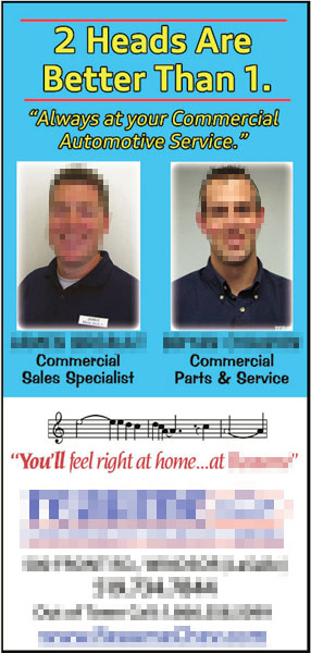
We’ve all seen the mug shot ad made famous by real estate and insurance agents. Buddy ads are a step worse. The bulk of the design is filled with vanity with no room left for an idea.
This example is definitely a twofer. In addition to its status as a buddy ad, the headline is an excruciatingly vapid cliché. The copy is about as informative as wallpaper.
A buddy ad isn’t worth improving. The only sensible option is elimination.
Blunder 9: We exist ad
These are essentially business card designs on magazine stock. There’s no compelling reason to call, and it has little branding power.
The only message that makes any impact is that the company exists. That’s not enough.
Blunder 10: Design monstrosity without a focal point
Only a heating and cooling man can cook up a concoction quite like this. Past job photos surround an image of his team. Horrendously formatted captions add turn an eyesore into full-on disfigurement. Ultimately the visuals say nothing to the disinterested reader because the clutter level is astronomical.
Instead of one image of a contented family on the vibrant lawn in front of their green-powered home, sky deep blue, we get boilers and chimneys.
Its only redeeming quality is the headline.
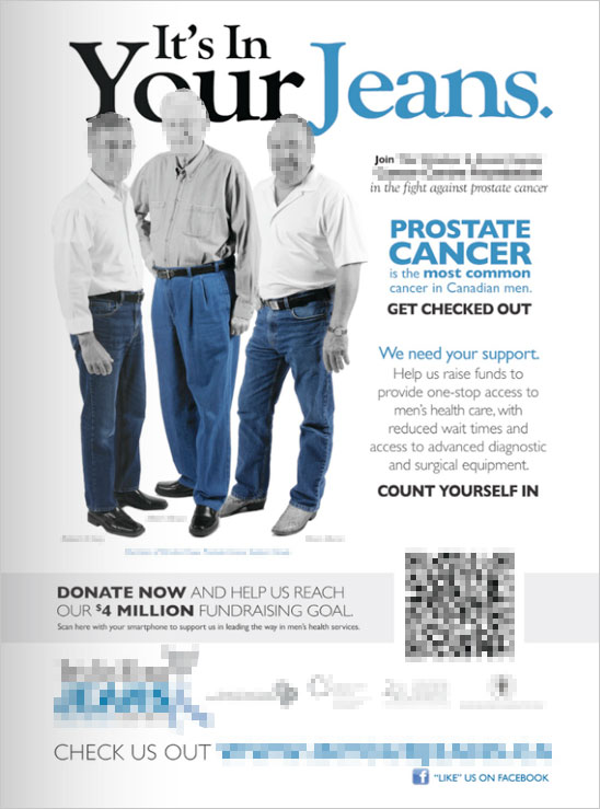
BONUS: Headlines with puns
The first print ad I made as an advertising student was for Dr. Martens. It had a pun in the headline. It was also terrible.
Headlines with puns are as awkward as a pimply tenth grader with braces and a lisp. Mix wordplay with an unwanted connection with male anatomy and you’ve got marketing jabber that could make even an urologist cringe.
Copy that reads “prostate cancer is the most common cancer in men” is a step in the right direction but is surrounded by noise.
This ad needs a compelling reason people should care in the headline. One statistical tidbit in the hands of a good writer could do it. For example: One in 7 men will develop prostate cancer during his lifetime; one in 28 will die of it.
–Icons: Scott Lewis, Travis Yunis, from The Noun Project

